No edit summary |
No edit summary |
||
| (13 intermediate revisions by 8 users not shown) | |||
| Line 8: | Line 8: | ||
| − | ==Keep (+ |
+ | ==Keep (+6)== |
[[File:Wiki-wordmark.png|thumb]] |
[[File:Wiki-wordmark.png|thumb]] |
||
| − | |||
#I prefer the current one, though I do agree we need a change, although I don't like your current design. So for now, I'm voting to keep the old one. {{Oleh Sig}} |
#I prefer the current one, though I do agree we need a change, although I don't like your current design. So for now, I'm voting to keep the old one. {{Oleh Sig}} |
||
| + | #Its hard to change, and its classic. Its a sign of the wiki. <font size="4"><font face="Arial">[[User:The Boy With The Pikachu Tattoo|<span style="color:#996699">Doo Doo</span>]][[User talk:The Boy With The Pikachu Tattoo|<span style="color:#CC99CC"> Doo Doo.....</span>]]</font></font> 21:59, April 24, 2014 (UTC) |
||
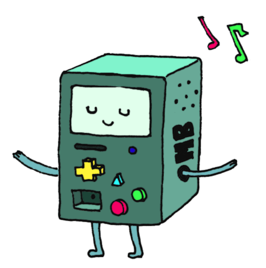
| + | #The current one's been around on this wikia for longer than I have, and I've grown use to it, it'll probably be a huge fright for it to go so suddenly.<div style="position: relative; -webkit-transform: rotate(-6deg)"><span style="letter-spacing: 3px"><span style="background-color:white"><span style="line-height:14px;color:rgb(0,0,0);font-size:14px;">[[File:BeemoGif2.gif|80px]][[User:Blue-Ribbonz|<span style="color:turquoise">Madness Is Forever</span>]]</span>[[File:beemogif.gif|75px]]</span></span></div> |
||
| + | #I honestly just hate the changing one. The one we have right now is fine! And why is this happening? Why is the writing crooked? Anyways, I just hate the design for the one since it's way too much and it just doesn't look good together. So I say keep. [[User:FrostyFire|FrostyFire]] ([[User talk:FrostyFire|talk]]) 05:43, April 25, 2014 (UTC) |
||
| + | #I don't really see a reason for a change. There is nothing wrong with our current one; it is simple, classic, and does its job of being a Hunger Games-related Wiki wordmark. [[User:MyWorld|MyWorld]] ([[User talk:MyWorld|talk]]) 02:19, April 27, 2014 (UTC) |
||
| + | #The other one is ugly as hell[[User:Wesolini|Wesolini]] ([[User talk:Wesolini|talk]]) 22:35, April 29, 2014 (UTC) |
||
| − | ==Change (+ |
+ | ==Change (+4)== |
[[File:Wiki2.png|thumb|Not final, just a proto type.]] |
[[File:Wiki2.png|thumb|Not final, just a proto type.]] |
||
| Line 19: | Line 23: | ||
#I really don´t like our old one, and I really want to get it replaced. However, the design for the new one is not really that great just yet. But I have faith that it´ll turn out great when it´s finished :3<br />{{Template:ErlendSig}} |
#I really don´t like our old one, and I really want to get it replaced. However, the design for the new one is not really that great just yet. But I have faith that it´ll turn out great when it´s finished :3<br />{{Template:ErlendSig}} |
||
#<span style="font-size:14px;">I agree with Erlend. </span>[[User:Tehblakdeath|Stop. HAMMERTIME!]]<span style="font-size:14px;"> (</span>[[User talk:Tehblakdeath|talk]]<span style="font-size:14px;">) 21:04, April 24, 2014 (UTC)</span> |
#<span style="font-size:14px;">I agree with Erlend. </span>[[User:Tehblakdeath|Stop. HAMMERTIME!]]<span style="font-size:14px;"> (</span>[[User talk:Tehblakdeath|talk]]<span style="font-size:14px;">) 21:04, April 24, 2014 (UTC)</span> |
||
| + | #I agree that looks sweet (thats pic cause everyone has those cool logo thinggys and ummm I dont know how to make them so I figured thats good enough) |
||
Latest revision as of 04:39, 30 April 2014
I think it is time to change the current wordmark. We've had it for a LONG while and change is always nice. So below, I say we vote to keep or change the wordmark.
This won't mean anything unless an admin sees. So for now, just vote for fun.
Edit: Please note that the "new" one I have posted is just there to pose as the new one. It doesn't mean that will be the new one.
Keep (+6)

- I prefer the current one, though I do agree we need a change, although I don't like your current design. So for now, I'm voting to keep the old one.
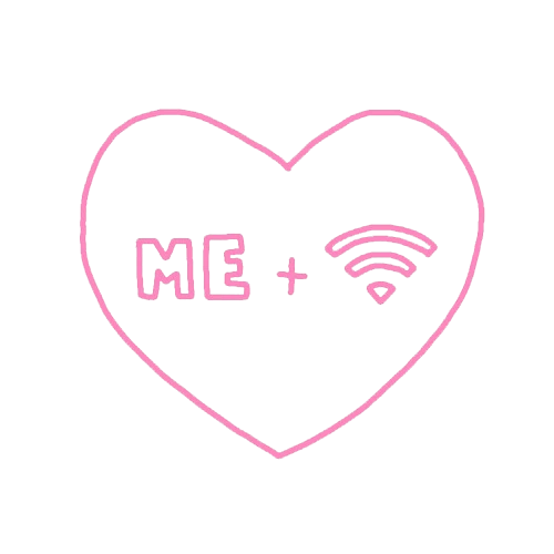
 Me and wifi, better than me and u ~ ♡ Oli ♡
 - Its hard to change, and its classic. Its a sign of the wiki. Doo Doo Doo Doo..... 21:59, April 24, 2014 (UTC)
- The current one's been around on this wikia for longer than I have, and I've grown use to it, it'll probably be a huge fright for it to go so suddenly.
- I honestly just hate the changing one. The one we have right now is fine! And why is this happening? Why is the writing crooked? Anyways, I just hate the design for the one since it's way too much and it just doesn't look good together. So I say keep. FrostyFire (talk) 05:43, April 25, 2014 (UTC)
- I don't really see a reason for a change. There is nothing wrong with our current one; it is simple, classic, and does its job of being a Hunger Games-related Wiki wordmark. MyWorld (talk) 02:19, April 27, 2014 (UTC)
- The other one is ugly as hellWesolini (talk) 22:35, April 29, 2014 (UTC)

Change (+4)


Not final, just a proto type.
07:52, April 24, 2014 (UTC)
- I really don´t like our old one, and I really want to get it replaced. However, the design for the new one is not really that great just yet. But I have faith that it´ll turn out great when it´s finished :3
 "I´m outside your window with a machete, nowhere to run babe”

- I agree with Erlend. Stop. HAMMERTIME! (talk) 21:04, April 24, 2014 (UTC)
- I agree that looks sweet (thats pic cause everyone has those cool logo thinggys and ummm I dont know how to make them so I figured thats good enough)